
| 일 | 월 | 화 | 수 | 목 | 금 | 토 |
|---|---|---|---|---|---|---|
| 1 | 2 | 3 | ||||
| 4 | 5 | 6 | 7 | 8 | 9 | 10 |
| 11 | 12 | 13 | 14 | 15 | 16 | 17 |
| 18 | 19 | 20 | 21 | 22 | 23 | 24 |
| 25 | 26 | 27 | 28 | 29 | 30 | 31 |
- `
- 깃허브 레포지토리와 로컬 코드 연결하기
- 미래내일일경험
- 백틱
- 하나은행
- 디지털하나로
- DIGITALHANARO
- 개발자교육과정
- Next.js
- 디지털취업
- 네이버로그인창만들기
- 디지털교육
- 프론트엔드배포
- 프론트엔드개발자양성과정
- 맥북백틱입력
- 배포
- 맥북백틱
- 프로젝트캠프
- 취준생
- kdt
- s3
- github
- 부트캠프
- 버전생성프로세스
- udemy
- 디지털하나로입학식
- 웅진씽크빅
- 유데미
- 스나이퍼팩토리
- Today
- Total
Land of Joe
23년 09월 14일 CSS 본문
[ CSS ]
1. font-size (기본값: 16px;)
2. font-weight (기본값: 200;)
ㄴ 사파리에선 모든 굵기가 적용되나/ 크롬에선 200, 400, 600만 적용 가능
3. display: block, inline, inline-block, none, flex
<div>의 display 속성은 block, <span>의 display 속성은 inline
( 알고보니 <div>,<span>의 태그적 특징이 아니라, 각 태그가 기본으로 가진 display 속성일 뿐이었다~~!
<img>태그의 display 속성이 inline인 것처럼 )
inline속성은 width를 바꿀 수 없다 ⇒ inline-block을 사용한다!!!
4. position: static(기본값), relative, fixed, absolute
relative:
fixed: width랑 height가 무조건 fit-content,
DOM구조에서 탈출해서 스크롤을 해도 설정한 left, top에 해당하는 화면의 특정한 위치에 고정된다
absolute: DOM구조에서 탈출해서 브라우저를 기준으로 특정지점에 박혀있게 된다 (그래서 잘 안 쓰인다)
5. 브라우저의 가로폭의 중앙에 위치시키고 싶다면?
inline속성을 가진 태그는 해당 태그의 부모 태그에 text-align: center;
block속성을 가진 태그는 해당 태그에 margin-left: auto; margin-right: auto;
( -> 여기서 알 수 있는 점: inline은 텍스트 취급을 하고 block은 태그 취급을 한다는 것 )
다른 건 쉽게 할 수 있고,
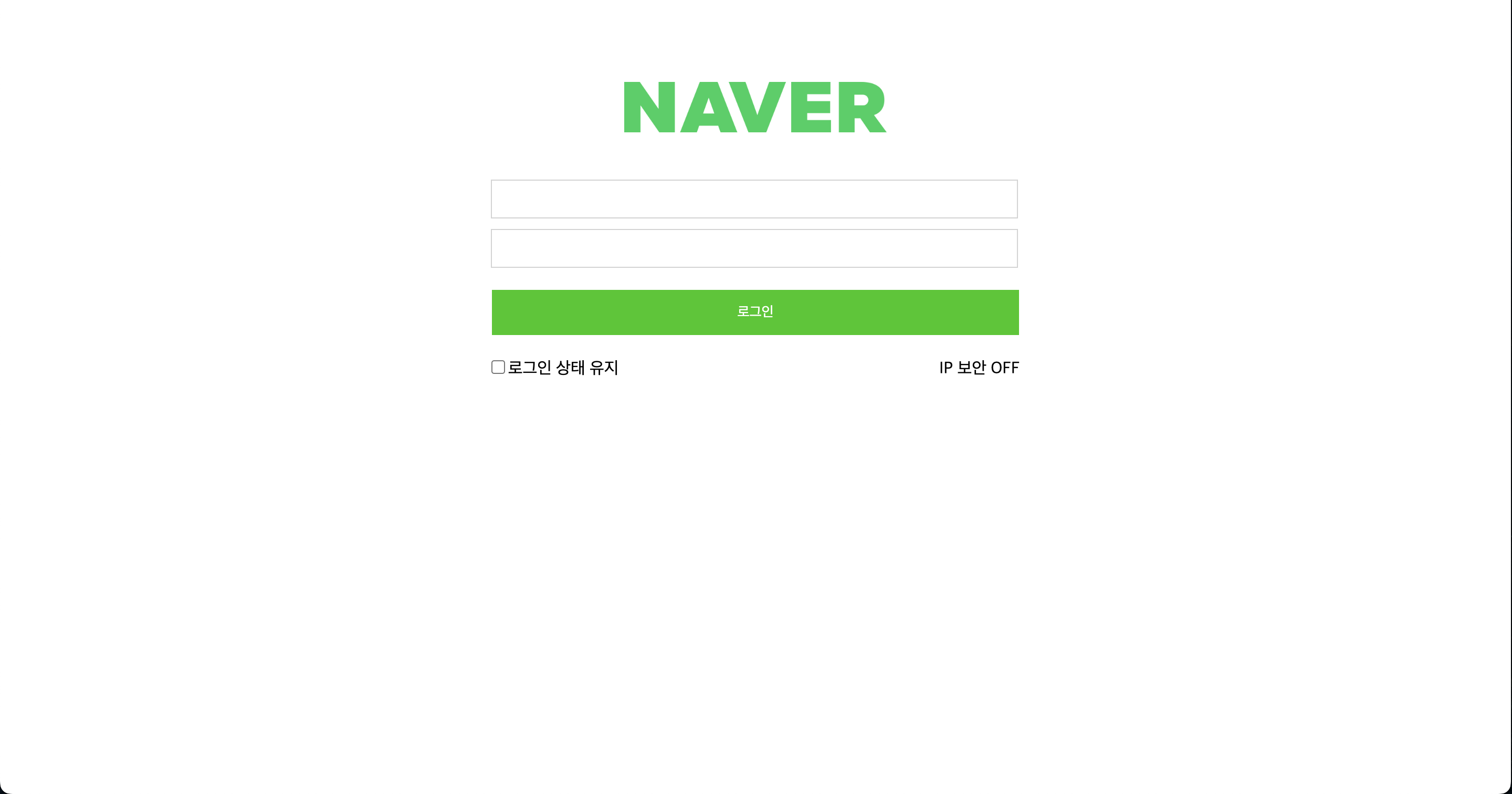
맨 밑 부분의 '로그인 상태 유지'와 'IP 보안 OFF' 둘 사이를 잘 떼는 방법은 기록해두어야겠다.
나는 display: flex; justify-content: space-between;을 이미 알고 있었기에 그 방법을 썼지만
display: flex;가 적용되지 않는 경우(+flex로는 해결되지 않는 애매한 곳에 위치해야할 경우)를 고려해서 DOM구조의 원리를 이용해서 해결해보라고 하셨다.
코드)
<div class="detail">
	<span id="stay"><input id="stay-checkbox" type="checkbox">로그인 상태 유지</span>
	<span id="off">IP 보안 OFF</span>
</div>
- 일단 병렬 배치를 위해 inline 속성을 가진 <span> 태그를 사용하였음
- 두 <span> 태그를 <div>로 감쌌음.
.detail {
    width: 100%;
    margin-top: 10px;
    margin-bottom: 10px;
}
#stay {
    display: inline-block;
    width: 49%;
    text-align: left;
}
#stay-checkbox {
    margin-left: 0;
}
#off {
    display: inline-block;
    width: 49%;
    text-align: right;
}
- #stay와 #off의 길이를 100% 중 반반(49%)로 설정해준다
이때 display: inline;일 경우 width 변화가 적용되지 않으므로 inline의 대체재인 inline-block을 활용한다!!
- text-align을 이용해서 #stay와 #off를 각각 왼쪽 끝, 오른쪽 끝으로 배치한다.
(전체코드는 다음과 같다)
<!DOCTYPE html>
<html lang="en">

<head>
    <meta charset="UTF-8">
    <meta http-equiv="X-UA-Compatible" content="IE=edge">
    <meta name="viewport" content="width=device-width, initial-scale=1.0">
    <title>Document</title>
    <link rel="stylesheet" href="naverStyle.css">
</head>

<body>
    <div id="naver-login">
        <img src="naver.png" id="naver-logo">
        <input class="inputs" type="text">
        <input class="inputs" type="password">
        <input id="login-btn" type="button" value="로그인">

        <div class="detail">
            <span id="stay"><input id="stay-checkbox" type="checkbox">로그인 상태 유지</span>
            <span id="off">IP 보안 OFF</span>
        </div>
    </div>
</body>


</html>
body {
margin: 0;
}
#naver-login {
width: fit-content;
text-align: center;
margin-left: auto;
margin-right: auto;
}
#naver-logo {
width: 250px;
margin-top: 50px;
padding-top: 30px;
margin-bottom: 30px;
}
.inputs {
display: block;
width: 500px;
height: 35px;
margin-top: 10px;
margin-bottom: 10px;
border: 1px solid lightgray;
padding: 0;
}
#login-btn {
background-color: #1EC800;
color: white;
border: 1px solid ;
width: 504px;
height: 45px;
margin-top: 10px;
margin-bottom: 10px;
padding: 0;
}
.detail {
/* display: flex;
justify-content: space-between; */
width: 100%;
margin-top: 10px;
margin-bottom: 10px;
}
#stay {
display: inline-block;
width: 49%;
text-align: left;
}
#stay-checkbox {
margin-left: 0;
}
#off {
display: inline-block;
width: 49%;
text-align: right;
}
느낀점)
오늘도 역시나 내가 주먹구구식으로? 혹은 직접 만들면서 부딪혀서 익힌 것들에 대해 제대로 정확히 배운 시간이었다.
쉬운 듯 쉽지 않은..... 이건 내가 현직자가 되고 경력이 쌓여도 계속 느끼지 않을까 싶긴 하지만..ㅎㅎ
오늘은 수업이 끝나자마자 집에 가고 싶은 욕망을 꾹 누르고 앉은 자리에 계속 앉아 이 기록을 남기는 중이다.
생각보다 얼마 안 걸리다니.. 바로 집에 갔다면 최소 한 시간은 멍 때리다가 밍기적거리면서 했을텐데ㅋㅅㅋ
과제도 열심히 해보자!!! 화이팅!
'📚 Educations > ⏳ StageUs' 카테고리의 다른 글
| 23년 10월 19일 프로토콜, 데이터베이스 (3) | 2023.10.19 |
|---|---|
| 23년 10월 12일 AWS EC2 이용한 웹서버 생성하기 (0) | 2023.10.12 |
| 23년 10월 05일 Javascript-2) CreateElement, list배열 (0) | 2023.10.05 |
| 23년 09월 28일 Javascript-1) 이벤트, 함수, 조건문, 반복문 (0) | 2023.09.28 |
| 23년 09월 07일 SEO, HTML (0) | 2023.09.09 |

